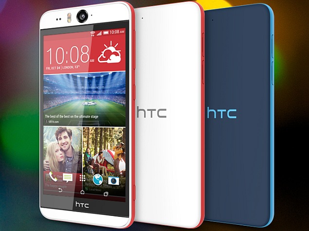
HTC Desire EYE Review
The first thing I notice about the Desire EYE is that it seems more playful in it’s design than some of HTC’s previous phone designs. It ditches the sleek, but drab black and grey colors from the HTC One and replaces it with a slick colored strip around the side of the phone. It doesn’t have a curved back so the phone sits flat on the desk. If you’re not used to a large phone, this phone does look pretty big and really long coming in at 5.2 inches. You will most likely have to use two hands to operate it, but HTC made some good button location choices to accomodate. The power button is below the volume rocker on the right side so righties will be able to easily toggle the screen on and off. There is also a dedicated camera button below the power button on the bottom right corner. It’s got a sort of matt finish which makes it feel comfortable in the hand, but that still didn’t make me completely take away my fears of dropping the device.
Advertisement
Advertisement
Categories
Subscribe Now
* You will receive the latest news and updates!


Social Media